Sunday, November 29, 2020

Last Page of Gyotaku Project

Children's story pages,  Mary M Payne


 This is the story of the Mediterranean Sea.  It is the story of fish...and the printing of fish . 

E is for Ectothermique.the scientific name for fish, almost 32,000 species, more than all the vertebrates put together.


M is for mussels..  a bivalve that lives in salty water or fresh.  Here in France we eat mussels whenever we can.  Delicious.  Bring me “ Moules Marinieres” we say. "sil-vous-plait".


P is for Pulpe..  a most intelligent mollusk with eight legs and a soft body.  It is also a tasty dish, but who dares to eat such a cunning creature. 


R is for red starfish.... The Mediterranean red star is called Echinaster sepositus, an echinoderm in the shape of a star.  Sounds like a Roman emperor, doesn’t it? 


E is for endangered...  All sea creatures are in peril now. Fishermen are taking too many fish and wasting fish with their callous methods.  And then there are plastics and all manner of  trash dumped in the seas. Shame on us.  We need to do better.


I is for Impression... the way the Japanese have done it for centuries called Gyotaku.   This is a way to record shape and size of a fish, a method started by the Samurai.    All you need is some ink and some rice paper. This story is also about Gyotaku.


N is for Neptune grass...  Great prairies of Neptune grass, 15 kilometers wide, have been growing in the sea for tens of millions of years.  Their fibrous materials, when turned by the waves make spherical balls which wash up on the shore. 


T is for tidal pools... Hardy organisms such as mussels, clams and sea stars shelter in tide pools near the shore. These creatures must adapt to differences in water/ salt content , currents, exposure to sun and predators.


E is for Ecosystem.... a community of organisms, animals and plants that share cycles of energy and nutrients.


S is for Sea bass… the most cultivated and the most commercially fished in the Mediterranean Sea.  We call it “bar “ in France and serve it with butter and lemon … always a tasty, white fish.


Maybe this story is also about good eating.  But I want this story foremost to be about respect for the gift of the Mediterranean Sea and all it's glorious creatures. 


My first and only Reduction print

Galet I, reduction lino print by Mary M Payne

Galet II reduction lino print 19x22 in. by Mary M Payne


I just tried to put this new entry on my art blog but it refuses to go there.  So hey, the two blogs are for the moment combined.

That series reminded me of another I had done a few years back, my first and only attempt at reduction printing.  

What is a reduction print?  One could say that printmaking is defined by contrast... value differences or differences in color. 

 For a reduction print, one most often uses color and linoleum.  The artist carves away or "reduces" parts of the printing block, printing one color at a time, usually printing from lightest to darkest colors since dark covers light. 

I started with this photo I took of galets and dove feathers.


   Next I transferred the design "backwards" onto a standard piece of lino cut 8.5 by 12 inches or 22x31cm.  I did this with carbon paper.

Charbonnel, my preferred printer's ink.

  Next I rolled my ink, color mixed to preference with a spatula down on a piece of glass to mix with a brayer and roll out onto the lino.  That would have been the pale blue.  You will see in this series that each print is different as I experimented with the colors and placement of colors.

Galet III reduction print by Mary M Payne

The next step was to take my gouges and scrape away all of the background on the piece leaving only the rocks and feathers.

After that there was no going back!

The second color to put down was the "blanc cassé".  

 I roll out the off-white ink which was in every object on the page, and inked the lino.

In order to insure there were no gouge marks onto the blue background, I put a piece of copy paper ( a mask) which would cover all the background just leaving holes for the objects now inked off-white.

 Then I ran all of it though my little home printing press that Monsieur had bought me.   

Next I cut away anything that was off-white only.   Except while looking at my lino plaque ... I seem to have left the stone in the middle standing without cutting it away!! I must have gone over it again in the end with off- white.  I think I still needed it in place to print the gold rim outline. 


 The next color was  yellow ochre. It appears in four stones and part of the feathers.  I printed everything with that color in it and then carved away four stones of that hue, the rim outline of the middle stone and the piece of the feather that was yellow.

That left two stones with gray and the part of the feathers.  For each color, I continued to use the copy paper mask to cover up the background so that it was a smooth blue.  

 After the gray ink, I carved away those two gray stones leaving only the stone which would have mostly black and the remainder of the feathers.  Although no stone is really black,  I wanted a stronger contrast.

 As you can see, I kept playing with the colors to get a better result so that each print is slightly different.  In the piece below you can see that I decided to give black to the first stone instead of the second stone. 

Galet IV reduction print by Mary M Payne


If anything this kind of activity is a brain game...lots of problem solving. 
 
Most reduction artists start with about 25 sheets of paper to produce 10 prints.  I inked ten and produced five. This is fun but not for the faint of heart. There are very few ways to correct as you go along. 

  By the way, you are the first to see this series.  I am taking some time off from art to remember...and not produce. With Covid confinement and no classroom meetings now, it seems like the time to reflect. 

P.S. And I am just going to say that the fonts are still morphing on their own on blogspot.  If you see something suddenly in huge letters or the opposite... please just go with it.  I don’t want to spend hours figuring out why.  


Friday, November 27, 2020

Gyotaku: Part VI

I is for Impression.  Collage by Mary M Payne

This is my offering for the word "impression".  As you may have noticed I am choosing both English and French words to name my pieces.  My prof. agreed that that was fine by her.   In this piece you see the prints I did of the fish called Pageot (red pandora in English).   
I called this "Impression" so I could talk a little about Gyotaku (meaning "fish+stone  Impression" in Japanese). 

As I said, I wanted this series to be loose and deconstructed a bit so I left the tear in the paper and glued it down that way.  The background sheet was inked with spray bottles of two colors and I found out the hard way on this piece, that in order for the color not to leak through to the fish, I needed to "fix" it with hairspray (or another fixative).  I figured that out before I glued down the last fish....but hey... it's not a mistake...it's a variation.

E is for Endangered,  Collage  by Mary M Payne

This next poster is "E" for endangered.  It is here I talk about pollution on the story page at the end.   This collage was made with two overlapping prints ( cut out and fitted together) pulled from the gelli-plate.  I laid down string and a piece of netting ( it was around a dry sausage) along side the fish and coral silhouettes to give the idea of man-made pollutants tossed in the sea.  

N is for Neptune Grass. collage by Mary M Payne

Here is my offering for Neptune Grass.  Neptune Grass is prehistoric seaweed endemic to the Mediterranean Sea. Its growth is so slow that scientists estimate that a prairie of 15 square meters has been growing for thousands if not tens of thousands of years. However as you might have feared, populations are declining rapidly due to pollution.

  What I have depicted here are the balls made of vegetation sloughed off by the grasses which show up on beaches of the Mediterranean . 

 I printed these "balls" from a red cabbage cut in half and dipped in acrylic.   The background is a spattering of red and grey liquid acrylics sprayed from small bottles onto a piece of rice paper. 


Gyotaku: Part V

    R is for Red starfish...collage by MaryMPayne
So by now you may have figured out that this is not what one considers art.  There is always a question in my mind about what  the difference is between art and illustration.

Someone said that art is the idea brought to life while illustration is a depiction or explanation of an idea.  Is it any clearer to you now?  No, nor to me either. 

   I think in this case, the parameters of the assignment make this project "illustration".   And I have begun to think of these pages as old fashioned posters that could be used as tools for teaching children.... a sort of book without a cover...a starting point for discussion.

This red starfish with the skinny limbs is the echinoderm ,classe Asteroidea found in our Mediterranean Sea, the sea that is ten minutes walk from my house.

For now, I will say that I constructed the red "sea fern" by selecting a section of a larger  stiff foam piece made by "art foamies.com".  I used only one part of the square "stamp" so it would have the appearance of a frond.   "Foamies"  are a new tool for informal printmaking. 

The blue background piece was pulled from my "gelli-plate " with which I use acrylics with a "retarder" so that the paint doesn't dry too fast.

The red starfish is printed on bristol and glued onto a piece of 300 gram Canson paper.  Here is the series so far:


First four pages of series,  MaryMPayne


Thursday, November 26, 2020

Gyotaku: Part IV


P is for Pulpe, print by Mary M Payne

I have a special fondness for the octopus.... "Pulpe"( in French).  Here are a few interesting facts about the various 300 species.

  1. An octopus is a mollusk that has eight limbs, a member of the Octopoda order.
  2. Octopuses as carnivores eat meat including fish, crabs, crayfish, shrimp and other mollusks.
  3. Octopuses can rapidly alter their soft bodies and squeeze into small gaps between rocks and coral.  I once saw this on a boat in Hawaii. 
  4. An octopus can grow a new limb if one is lost.
  5. An octopus has three hearts. One heart is used to pump blood between its organs. The other two are used to pump blood through its gills
  6. The mimic octopus (Thaumoctopus mimicus) is known for its ability to mimic other marine animals. They can mimic other dangerous marine animals, like eels, lionfish and sea snakes.
  7. The seven-arm octopus (Haliphron atlanticus) has been observed having a complex relationship with jellyfish. They appear to work together in capturing prey and protecting each other.
  8. The veined octopus (Amphioctopus marginatus) has been recorded using tools. He can gather up seashells and coconut shells and build himself a shelter sometimes with a door to hide behind. 
  9. Octopuses appear to be very intelligent and most likely the smartest invertebrate. Experiments have shown they can store both short and long-term memories.
For this project I took myself to the fish market at Place Charles de Gaulle to buy an octopus to use for Gyotaku but then to cook and eat it. Even though I have eaten Octopus in restaurants,   I have always been reluctant to cook one.   I have to say it was delicious once all the India ink was washed off and I bathed it in vinaigrette

As I made several impressions of the Octopus I found that the whole print, showing all eight limbs, is an impressive and overwhelming presence on the page.  Instead I chose to use only a part of the printed Octopus in two of the pieces of the series.  

FYI, the background on this collage was made by wrapping a plastic bag around a coffee can tied with a string and rolling it in different colored acrylics then onto the rice paper.  

  The plant-like prints were made from a  Chinese cabbage leaf and part of a web-like foam stamp I had bought commercially for journaling.   The clam is carved from rubber and inked with a stamp pad. 

It's true there are printing possibilities everywhere you turn.  


Wednesday, November 25, 2020

Gyotaku Part III


Moules. Print by Mary M Payne


Its a sunny, crisp day here in Nice...we are digesting last night's speech from President  Macron explaining our gradual release from lockdown for Christmas and then, possibly, back to confinement by January 20. 

  It is all a bit bewildering , especially the part about the vaccine being ready by December!!!

  All the iconic blue chairs have been removed from along the Promenade des Anglais and as of last week, the dozens of benches that dotted the sea have been unbolted and locked away.
  No more lingering to listen to Old Man Mediterranean and chat with a neighbor.

  With confinement I don't actually have an art class to go to anymore...classes being on Skype...so I am taking time out from class to report what I have done online .  I see that I have not weighed in on my art blog for two years.   I know I have a few followers on this one though.. so "voila".  

Back to the fish series...

Above is the page I created for the letter M for Moules (French) or Mussels. 

 I originally envisioned using my Chinese character seals on some of the pieces as this type of seal or chop is used by the Japanese as well and it was the Japanese who created Gyotaku. 

For that theme, I found some 1950's Japanese newspaper from Etsy and I used that as background for this collage.   

The "moules" stamps I carved from a piece of soft rubber- like material that can be found in craft stores. 

The red paper is a "gelli-plate" creation.  You will see it again for the "endangered" piece.


Tuesday, November 24, 2020

Gyotaku Part II


E is for Echinoderm. 33x45 cm.    Print by Mary M Payne


The next step in my research was to decide on a format and a paper for a support.   Since I studied printmaking for some years I had a supply of Arches BFK Rives, probably the most sought after paper for all printmaking.  

It is a soft 100% cotton “vellum” without acid and each sheet is water-marked .  Each piece has two natural deckled edges and two tear deckles.  Those are the soft fringes that edge these mould-made papers from France.

BFK Rives comes in several sizes, the smallest is 56x76 cm at 280 grams per square meter costs 7.45 euros a sheet.   The 80x 120 sheet is 300grams and goes for 15.95 euros for one sheet. But since we bought our paper for the print class in bulk, I paid less than that. 

Pricey, yes, but this paper is so gorgeous and with the art supply store shuttered because of Covid, I decided I wanted to use this for my support. 

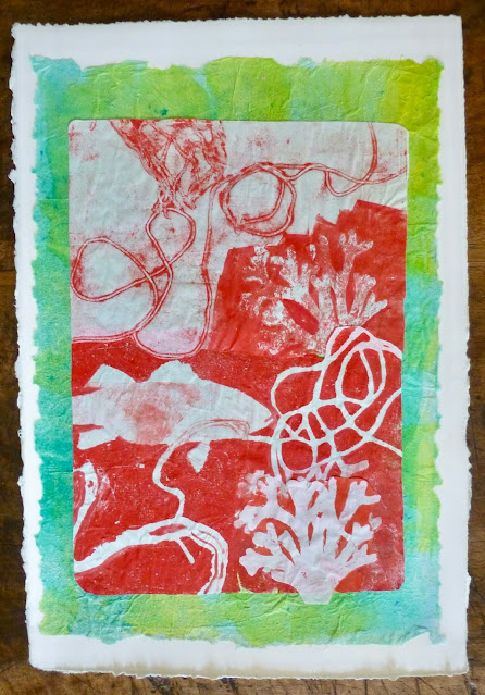
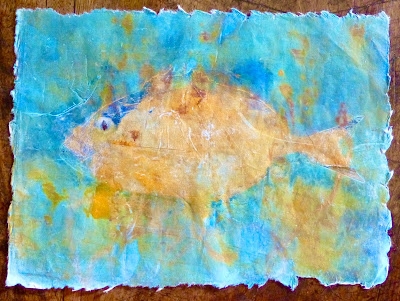
 With the fish being large and my instinct to work large I decided to lay out a composition with an ink sprayed piece of rice paper sprinkled with a few imprints of a leaf of Chinese cabbage and the fish torn from my Gyotaku pages.  I decided to keep it loose and informal. 

    The acid yellow- green I chose is a bit startling and perhaps hard to place with other colors but as a piece by itself it was good.    I showed Corinne, and she wanted me to cut it in half and use at least one half in the finished series.  

I hesitated. There is that moment when you think you have done a finished composition and the idea of tearing it in half is well....outrageous.    But half way through the next week I got over that and divided the piece in two.   I am using the two halves as the front and back covers ....so to speak.  I added another fish to the back page to illustrate  S for sea bass.

To adhere the rice paper to the BFK Rives and the rice paper fish to the background I used Golden" gel matte" only on the underside of each.  I did not want to risk a shiny appearance by using it to seal the top.

Next, I had to decide on what I wanted to depict in the series with the 10 letters of the word: Emprientes.   As you can see there are three letter E’s in the word. ...and no fish that I know of starts with the letter E...  ( except perhaps Eel) so this is what I came up with:

E- Echinoderm 

M- Moules ( Mussels)

P- Pulpe ( Octopus)

R- Red Starfish

E- Endangered

I-  Imprint (Gyotaku)

N- Neptune Grass

T- Tide Pools

E- Ecosystem

S- Sea Bass


So for the first half of my severed “masterpiece“ of the pea green sea...I start with the word Echinoderm, the classification of all fish, all 26,000 species of them...more than all the other invertebrates put together. 

Monday, November 23, 2020

Gyotaku Part I

" Pageot" and "bar" by Mary M Payne. 

It is time to show you that I have not been entirely idle... sitting around and playing video games or surfing You Tube while the pandemic rages around us. 

Ok. Ok. I do admit to dabbling with a couple of games ...but only after I have completed 3 hours of slave labor in the garden or house and have completed a bike ride along the sea in the early morning hours. 

I have to keep things in balance or I find myself falling down the rabbit hole.  I find it particularly hard to be so far away from many of the people I hold most dear during this time fraught with questions and confusion.  And even seeing local friends is prohibited now with the national lockdown. 

So for a change of mood, I want to show you my last art project.

Our assignment was to use common printing techniques without using a press and to create ten images around the theme of the word "Empreintes". ...each image using one of the letters of the word.

   There are hundreds of techniques used in schools and by  art journal artists using found materials to make prints... particularly plants and vegetables.  There is the gelatin plate for mono printing that I have reviewed before.  There are sheets of rubber that can be carved into stamps..etc.  And one can invent any number of print backgrounds with found materials.  So where to start...


Gelli print by Mary M Payne


I have always had a remote fascination for the Japanese
process of fish printing called Gyotaku.  Gyo( fish) taku (stone impression) was used first by the Samurai in the mid- 1800's to record the largest of the "catch" and for fishing competitions.  Since that time it has been the technique for many an artist and is used regularly in Japan today to record particularly impressive fish or memorable fishing expeditions.

It requires a deceased fish ( a dead fish sounds callous and smelly), some ink and some rice paper. The object is also, for me anyway, to eat the fish afterwards...lest it be killed for naught.  I couldn't find cuttle fish ink but I researched India ink and believe that it is non toxic.

As a  theme for the project I chose " Marine life of the Mediterranean".

The first thing was to bring home a fish and try it and to that end I found that the corner market had cleaned and scaled "bar" ( sea bass) packaged and ready to eat. 

After an hour of experimentation with my first fish,  I found that too much ink produces little definition of scales (or ink blots) and too little ink leaves a blank spot on the paper. 

 To even out the ink then, I used a make-up sponge as a dabber and experimented with how to hold the fins out to be inked as well ( very difficult).  In the end I made a cradle to hold the fish by cutting a lozenge shape in a piece of heavy cardboard.  And I diluted India ink and used a thin rice paper made for calligraphy.  

Here is my first attempt...with the sea bass.

Sea Bass print by Mary M Payne


In the case above, I used a wooden prop to open the mouth of the fish but afterwards I abandoned this un-natural position.

   I also used my little Chinese chops that I am so fond of.  The teacher was not amused and refused to allow them in the series.  One of these is my name in Chinese characters and the other one reads: " pervasive moonlight...meaning home, hearth and family.