 |
| Galet I, reduction lino print by Mary M Payne |
 |
| Galet II reduction lino print 19x22 in. by Mary M Payne |
That series reminded me of another I had done a few years back, my first and only attempt at reduction printing. 
The next step was to take my gouges and scrape away all of the background on the piece leaving only the rocks and feathers.
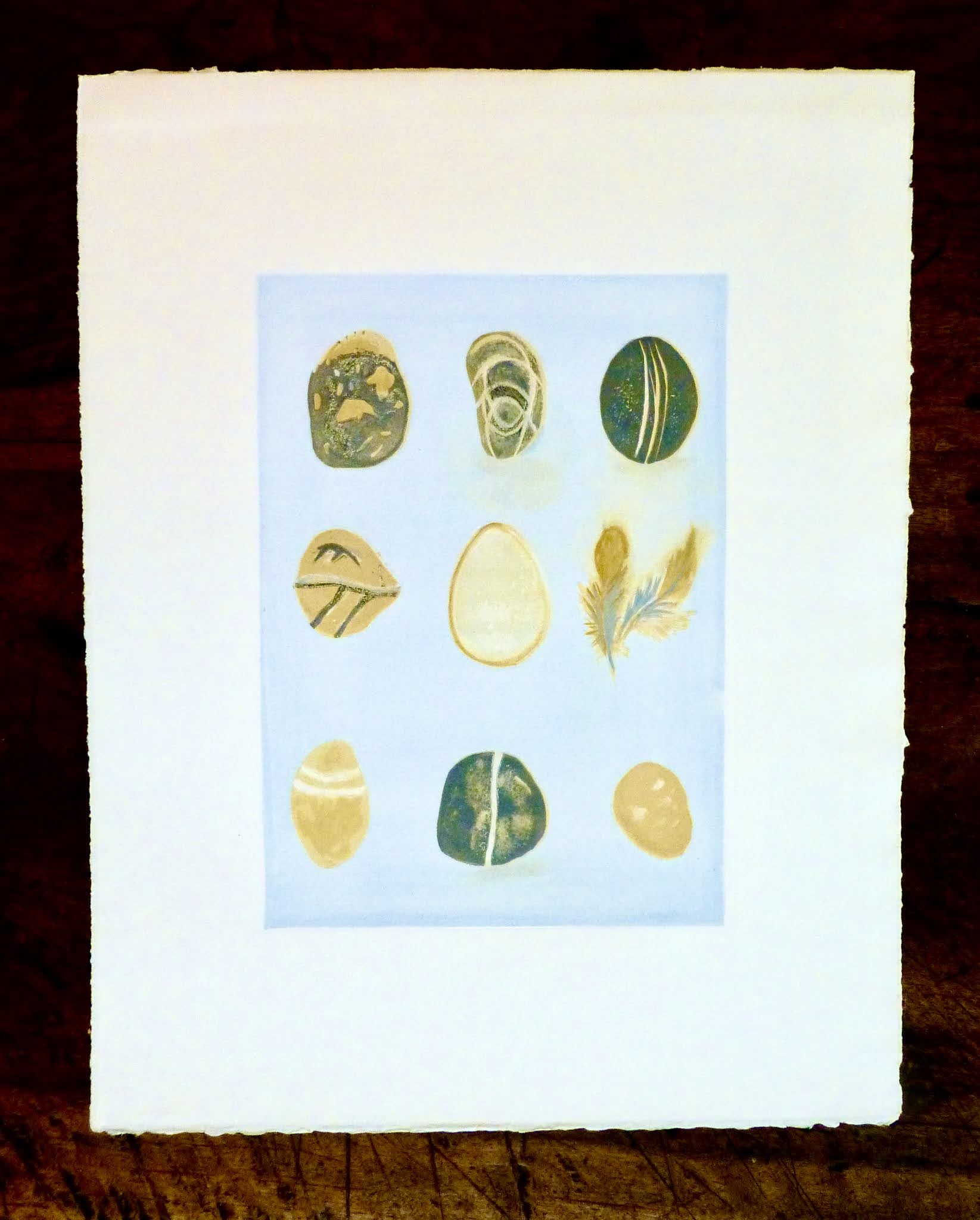
What is a reduction print? One could say that printmaking is defined by contrast... value differences or differences in color.
For a reduction print, one most often uses color and linoleum. The artist carves away or "reduces" parts of the printing block, printing one color at a time, usually printing from lightest to darkest colors since dark covers light.
I started with this photo I took of galets and dove feathers.

Next I transferred the design "backwards" onto a standard piece of lino cut 8.5 by 12 inches or 22x31cm. I did this with carbon paper.
 |
| Charbonnel, my preferred printer's ink. |
Next I rolled my ink, color mixed to preference with a spatula down on a piece of glass to mix with a brayer and roll out onto the lino. That would have been the pale blue. You will see in this series that each print is different as I experimented with the colors and placement of colors.
 |
| Galet III reduction print by Mary M Payne |
The next step was to take my gouges and scrape away all of the background on the piece leaving only the rocks and feathers.
After that there was no going back!
The second color to put down was the "blanc cassé".
I roll out the off-white ink which was in every object on the page, and inked the lino.
In order to insure there were no gouge marks onto the blue background, I put a piece of copy paper ( a mask) which would cover all the background just leaving holes for the objects now inked off-white.
Then I ran all of it though my little home printing press that Monsieur had bought me.
Next I cut away anything that was off-white only. Except while looking at my lino plaque ... I seem to have left the stone in the middle standing without cutting it away!! I must have gone over it again in the end with off- white. I think I still needed it in place to print the gold rim outline.
The next color was yellow ochre. It appears in four stones and part of the feathers. I printed everything with that color in it and then carved away four stones of that hue, the rim outline of the middle stone and the piece of the feather that was yellow.
That left two stones with gray and the part of the feathers. For each color, I continued to use the copy paper mask to cover up the background so that it was a smooth blue.
After the gray ink, I carved away those two gray stones leaving only the stone which would have mostly black and the remainder of the feathers. Although no stone is really black, I wanted a stronger contrast.
As you can see, I kept playing with the colors to get a better result so that each print is slightly different. In the piece below you can see that I decided to give black to the first stone instead of the second stone.
 |
| Galet IV reduction print by Mary M Payne |
If anything this kind of activity is a brain game...lots of problem solving.
Most reduction artists start with about 25 sheets of paper to produce 10 prints. I inked ten and produced five. This is fun but not for the faint of heart. There are very few ways to correct as you go along.
By the way, you are the first to see this series. I am taking some time off from art to remember...and not produce. With Covid confinement and no classroom meetings now, it seems like the time to reflect.
P.S. And I am just going to say that the fonts are still morphing on their own on blogspot. If you see something suddenly in huge letters or the opposite... please just go with it. I don’t want to spend hours figuring out why.
No comments:
Post a Comment